#Unicode Font Names Support
Explore tagged Tumblr posts
Visit Tumblr Blog
Explore Tumblr blogs with no restrictions, modern design and the best experience.
Last Seen Tumblr Blogs


Fun Fact
In 2020, Tumblr had 29.4 million users in the US.
Text
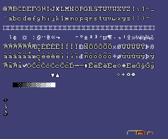
Obsolete and Variant Latin Characters (Consonant Edition)
Saw a post about 'sharp s' ('ſ') and wanted to share a bit about the VARIETY of characters you can use for (fake) Old-Timey Spelling.¹ Not including any vowels, because too many of them are still popular and used for FAR too many sounds, but I strongly suggest adding 'Æ', 'æ' everywhere. Æshes are FUN!
Note: A lot of letters look really different in different styles of writing. Most of these do not have separate characters in Unicode - if you want to write a certain shape of 'h', you just use a font that uses that shape of 'h', for example. Like, Blackletter fonts don't have separate characters in Unicode (except for the ones used by weird German linguists!) even though they can look VERY different from other fonts.
But certain sometimes there ARE separate symbols. Gaelic speakers got frustrated enough by stupid English 'g's that we have Insular variants for a bunch of letters that have historically been written differently in Ireland, for example. Instead of having to use a completely different font when writing for an Irish audience, you can just set up a keyboard layout that will call up the Insular characters, and if you change your font, the characters won't change to English versions. (They might become blank boxes if the font doesn't SUPPORT those characters, but that's a different issue!)
We also have a bunch of variants for characters that can be written multiple ways in the same Medieval manuscripts, because Medieval historical linguists/paleographists have a LOT of influence over Unicode's development. (And Angkorian Khmer paleographists seem to have NONE 😭😭) This lets historians distinguish which variant is being used in a manuscript, which can let them learn about subtleties of use.
And some of these variants are still in use in some languages! They can be stored as variants in many fonts and automatically applied without needing a separate Unicode character, but not everyone wants to trust the appearance of their writing to a computer's decisions, so it's good to have distinct characters we can choose to use ourselves.
Finally, there are a few characters that are actually distinct. Not variant forms of another (Latin) character at all! We're going to start with those:
thorn - Þ, þ
used to make both of English's 'th' (/θ/ and /ð/) sounds, as well as the same sounds in Scandinavian languages, and in Middle Scots. From an Elder Futhark rune ('ᚹ') called 'þurs' (or 'þorn' in Anglo-Saxon). Still used in Icelandic. Alternated with 'ð'. Restricted in use to common abbreviations after becoming very similar to 'ƿ' ('wynn') and 'p', and eventually replaced entirely by 'th'. Now often replaced by 'y' in fake-old text, because early printing presses did not have thorns, but did have 'y's, and they looked somewhat similar.
wynn - Ƿ, ƿ
used in Old English for 'w' (/w/) sounds. From an Elder Futhark rune ('ᚹ') of the same name. Replaced by 'uu' which developed into 'w' (but see 'Anglicana w' below!) Fell out of use after becoming very similar to 'þ' ('thorn') and 'p'.
Variants and Alternate Shapes:
Insular d - Ꝺ, ꝺ
Shape of 'd' used in Insular fonts. Still in use in Ireland.
ðæt/eth - Ð, ð
used to make both of English's 'th' (/θ/ and /ð/) sounds, as well as the same sounds in Scandinavian languages. Alternated with 'þ' ('thorn'). Seems to have derived from 'd', possibly through 'ꝺ' ('Insular d'). Still used in Icelandic. Some people like to pretend that 'ð' stood for /ð/ (in 'that') and 'þ' stood for /θ/ (in 'thing'), but it was rarely that clean and simple.
Insular f - Ꝼ, ꝼ
Shape of 'f' used in Insular fonts. Still in use in Ireland.
Insular g - Ᵹ, ᵹ
Shape of 'g' used in Insular fonts. Still in use in Ireland. Affected a LOT of other fonts and how they developed.
yogh - Ȝ, ȝ
derived from 'Insular g' ('ᵹ'), this character was used for 'y', 'gh', and a variety of other velar and palatal sounds (/j/, /ɣ/, /g/, /ç/, /dʒ/, etc.) all of which were written with 'g' in Old English. Fell out of use after becoming too similar to 'z'.
Insular r - Ꞃ, ꞃ
Shape of 'r' used in Insular fonts. Still in use in Ireland. Very similar in appearance to 'Insular s' ('ꞅ').
r-rotunda - Ꝛ/Ꝝ, ꝛ/ꝝ²
version of 'r' used after round letters like 'o', 'b', 'p', 'h', and 'ꝺ' ('d'), especially in blackletter fonts (where the letters are really close together and square). Basically use the previous round shape as their upright line.
Insular s - Ꞅ, ꞅ
Shape of 's' used in Insular fonts. Still in use in Ireland. Very similar in appearance to 'Insular r' ('ꞃ').
long s - ſ/ʃ
alternated with 'round s' ('s') in ways that ALMOST followed rules. Usually wasn't used at the end of words. Seems to have stopped being used simply because printers thought they looked old-fashioned?
sharp s - ẞ, ß
derived from 'ſʒ' (a 'sharp s' and 'tailed z'. Possibly also from 'ſs'). Used in German languages. Stands for /s/, with complex rules (which have changed over the years!) for when it alternates with 's' and 'ss'.
Middle Scots s - Ꟗ, ꟗ

derived from 'ſs' (a 'sharp s' and 'round s'). Stands for /s/. Very similar to 'sharp s'.
Insular t - Ꞇ, ꞇ
Shape of 't' used in Insular fonts. Still in use in Ireland.
Middle Welsh v - Ỽ, ỽ
a variant of wynn (or at least related) this character was used for 'u', 'v', and 'w' (/u/, /v/, /w/) sounds in Middle Welsh.
Vend - Ꝩ, ꝩ
a variant of 'wynn' ('ƿ'), either through the Old English letter, or the Elder Futhark rune ('ᚹ'). Used for /w/.
Anglicana w - Ꟃ, ꟃ

Modern 'w' derived from two 'u's together (or 'v's, they were variants of the same letter at the time). The 'uu' ligature (letters squished together) replaced earlier 'wynn' ('ƿ'). Except the story isn't that clean.
Wynns kept being used alongside double 'u's. And sometimes they'd be used WITH 'u's! 'Uu', 'uƿ', 'ƿu' and 'ƿƿ' were all possible ways to write the /w/ sound during the Medieval period. 'UU' was combined into 'w', but some of the other combinations were also squished together into really WEIRD (to modern eyes) 'w's, now called 'Anglicana w's. They've got little '3's on the right side!
tailed z - Ʒ/Ꝣ, ʒ/ꝣ
variant way to write 'z', the reason why most cursive 'z's have tails. Comes from Medieval Gothic and Early Modern Blackletter fonts.
-
¹ Actual use for Old-Timey Spelling should be questioned. You can makes things really hard for screen readers very quickly!
² Ꝝ, ꝝ are actually Medieval abbreviations for 'rum', a common Latin word ending. I wanted to show how flat the tail could be, you shouldn't actually add the line.
-
Thank you @floppergostic for letting me know which characters weren't showing up!
-
[You can stop here if using a screen reader.]
Þiꞅ iꞅ a ỽeꝛy loỽely ænd ꞃeaꝺable ꞇexꞇ ƿiþ ꞇꞃue Meꝺieỽal ꝼlaỽouꞃ!
#let me know if any of the characters don't show up#I'll add pictures#anglicana w and middle scots s have VERY limited font coverage#paleography#historical linguistics#latin alphabet#old english#lots of generalizations here!
5 notes
·
View notes
Text
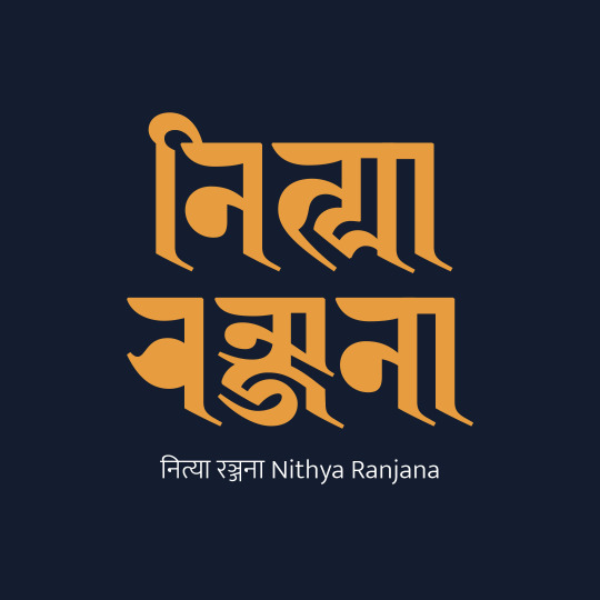
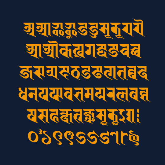
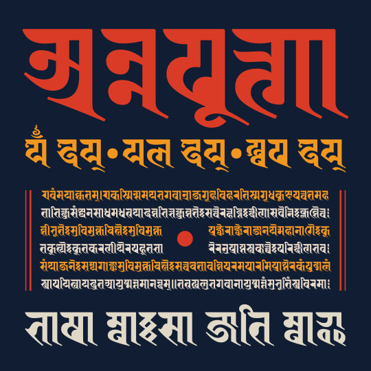

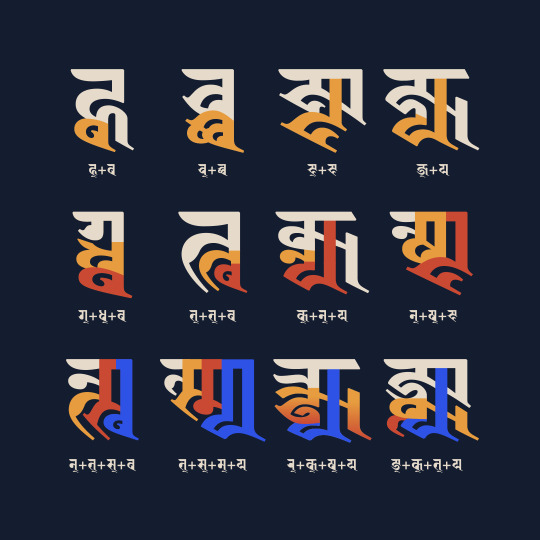
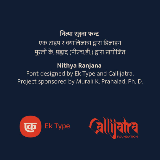
Super excited for our new release – Nithya Ranjana! A typeface based on the calligraphic style of Ranjana script from Nepal. Sponsored by Murali K. Prahalad, Ph.D. Designed by Tathagata Biswas and Noopur Datye (Ek Type) with support from Ananda K. Maharjan (Callijatra)
Nithya Ranjana is a typeface based on the calligraphic Ranjana script practiced in Nepal. Ranjana originated sometime between the 8-11th centuries and is used to write Sanskrit and Nepal Bhasa. It was mainly used for writing Buddhist and Hindu texts in South Asia and is also used for cultural contexts by the Newar people of the Kathmandu valley in Nepal. It has a rich legacy in manuscript calligraphy, stone inscriptions, wood engravings and paintings, but it has had limited digital representation due to its complexity and lack of Unicode support.
The challenge in creating the Nithya Ranjana font was to strike a balance between Ranjana's heritage and contemporary requirements. Apart from vowels, consonants, numerals and punctuation marks, Nithya Ranjana supports 750+ unique conjuncts used in Nepal Bhasa, Sanskrit and Pali. It includes an additional 500+ character-specific matra forms and matra-specific character forms to correctly and elegantly represent its many unique combinations. It has four stylistic sets, one each for alternate conjuncts and above base matras, and two for 40 Kutakshar forms (monogram-style word marks) making it ideal for historical and contemporary usage.
The Ranjana script does not have Unicode support to date. Hence, this typeface is currently available in 2 versions – Nithya Ranjana DU (based on Devanagari Unicode) and Nithya Ranjana NU (based on Newa Unicode). We hope to update it to Ranjana Unicode as and when the proposal for Ranjana Unicode is accepted.
This project was initiated and sponsored by Murali K. Prahalad, Ph.D. His interest in helping create a modern font for Ranjana is deeply linked to his passion for preserving the world’s Sanskrit heritage for future generations by ensuring the successful transition of Sanskrit into the digital world. He has a keen interest in scripts that facilitated the spread of Sanskrit literature and knowledge across Asia. This font is named after his eldest daughter Nithya, for whose generation he hopes to preserve this tradition.
Nithya Ranjana is designed, engineered and maintained by Ek Type, India with support from Callijatra, Nepal. Key contributors of this project are Tathagata Biswas (Type Design), Noopur Datye (Type Design), Ananda K. Maharjan (Script Expert) and Sarang Kulkarni (Project Management).
Download: https://github.com/EkType/Nithya-Ranjana/
7 notes
·
View notes
Text
I'm gonna ramble about fonts now
There's a lot that you have to do to make a font that you can regularly use. Even just upper and lowercase letters is 52 characters, but add on numbers, their shift characters, and basic punctuation and you're at around 80 characters. And most keyboards can type 94(ish) characters
So any font that's going to be regularly used on the internet needs nearly 100 characters. And each one of those needs to be made individually. There's probably some tricks like mirroring and rotating pqbd and maybe making some tweaks, but there's still no escaping having to make nearly 100 characters
And then after you've made those characters, you have to define where the top and bottom of the line are, as well as where the left and right sides of the letter are. Then you have kerning which is adjusting the spacing between specific pairs of letters because maybe you have a fancy cursive font and you don't like how some of the loops overlap. Even for simpler fonts, kerning is done to make the spacing nicer

There's literally thousands of pairs to check, and if you do it wrong then there's gonna be someone who notices
Here's some more examples of kerning


And a lot of this goes unnoticed by most people. They just scroll through a bunch of fonts until they find one that they like
And the idea of having to pay for a font seems silly on the surface (why would you have to pay to write something) but there's actually a ton of work that goes into fonts so the fact that we have such good fonts for free is actually kinda amazing
I'm sure font designers are getting paid *something*, but they aren't getting nearly enough appreciation imo. I know it's unrealistic to expect everyone who made everything that's commonly used to get the appreciation they deserve, but the fact that I don't know who made Arial, Helvetica, Georgia, or even Times New Roman (which was the required font for my essays in high school) is crazy to me
(btw, Arial was made by Robin Nicholas and Patricia Saunders, Helvetica was made by Max Miedinger and Eduard Hoffmann, Georgia was made by Matthew Carter, and Times New Roman was made by Stanley Morison and Victor Lardent)
ALSO I never really think about fonts at all. Like, I know the names of a few fonts but I can't identify any of them. Maybe I could pick out Courier, but that's probably just because it's the only monospace font that I know
Another thing that I never think about is language support. If I write 日本語の何か, either the font that Tumblr uses supports both Japanese and English, or it recognises that the unicode is for Japanese characters and switches fonts automatically. I can't check because I'm on mobile, but it's cool either way
Actually, I just googled and apparently Tumblr uses Neue Helvetica, which has characters for Latin, Cyrillic, Hebrew, Greek, Japanese, Korean, Hindi, Urdu, Khmer, and Vietnamese, so it is using the same font. The wiki article only lists Max Miedinger and Eduard Hoffmann as the designers, so it sounds like those guys made thousands of characters
Also, Max Miedinger's birthday was Christmas Eve which is pretty cool
I was about to hit post, but I just realised I still haven't talked about how fonts are an art even though I never think of them when I think about types of art
Okay now send post
1 note
·
View note
Text
Sims 3 still keeps on giving sometimes
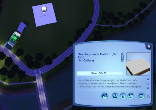
True to the game that keeps on giving, I did some testing tonight as to which exact Unicode characters that are accepted by the font used by Sims 3's Latin-script locales, and which ones aren't.
Some are less obvious than others (e.g. the Dutch Florin sign ƒ), while some that one would think would've been supported were in fact not (e.g. the macOS ⌘ and the Polish-Welsh ẃ).
The idea was in part that this testing would help players add more magic akin to Disney Fairies (or rather, ƒairi℮∫), but instead it appears I have brought back the very intricate online naming schemes in TrackMania United Forever back from the dead. 😅
Exact results of the tests can be found at the time of writing at https://sims.fandom.com/wiki/Game_translations#Language_fonts
Oh, and a pretty strange bonus discovery:

If a line starts with an invalid character, then the following characters on that line will change their fonts to some sort of quasi-"high fantasy" font thingie.
#the sims 3#ts3#sims 3#unicode#games#pc games#tech#tests#fonts#the game that keeps on giving#trackmania united forever#trackmania nations forever
0 notes
Text

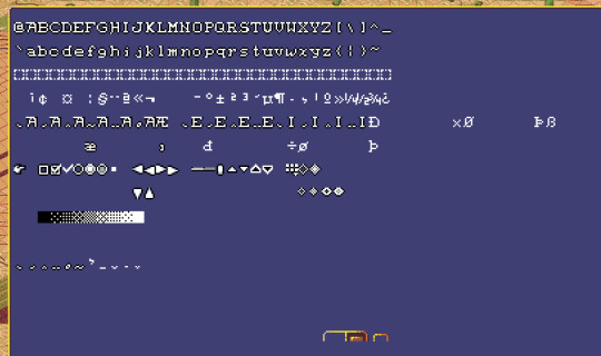
I added rudimentary support for accented glyphs. This is me printing all the code points corresponding to most of unicode page 1. Don't pay attention to the accented 'i's. Or the cedillas.
(I'm decomposing character codes into glyph sequences so that I don't have to draw every single permutation of these characters. This opens the way towards better font support for other languages. Not that I'm planning on actually doing that any time soon. I mostly did this because some character names have weird accented glyphs in them, so I kind of needed to be able to render those.)
1 note
·
View note
Text
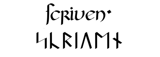
Check Out Scriven, a Custom Medieval/Ultima-Inspired Font
Scriven is a custom, open-source, medieval-style font that incorporates the various languages that feature in the "Ultima" games.
A GitHub user who goes by the handle smithkm — also known by the Dragon Name Hai-Etlik Dragon — has been developing a custom medieval-style font, which he calls Scriven, that will support most of the languages that feature in the Ultima games…and possibly, eventually, other languages as well: It will support English written with Latin script as well as the Runes from the Unicode Runic block for…
View On WordPress
0 notes
Text
Aesthetic Fonts
𝕬𝖊𝖘𝖙𝖍𝖊𝖙𝖎𝖈 ꜰᴏɴᴛꜱ ɢᴇɴᴇʀᴀᴛᴏʀ
Aesthetic fonts are another form in the Font family with beautiful characters made of Unicode. Yes, the characters in Aesthetic fonts are created with Unicode. That’s why they are so beautiful. You can generate your simple font style to Tulisan Aesthetic for your social profile bio, the caption of your images or your posts. Aesthetic bio is mostly used for IG Bio, Facebook Posts or WhatsApp text status. Aesthetic fonts are generally small in size as they are made using superscript/subscript or Japanese-style fonts.
𝕳𝖔𝖜 𝖙𝖔 𝖈𝖗𝖊𝖆𝖙𝖊 𝕬𝖊𝖘𝖙𝖍𝖊𝖙𝖎𝖈 𝕱𝖔𝖓𝖙𝖘?
To make your text Aesthetic, type the word or line in the box above & the library of the font family will show the number of results in Tulisan estetik font. You can choose your good-looking font from the list & you can copy it from here and use it for your digital purpose. You can use these fonts to create your name or the first character of your name as well.
The name generated through aesthetic font will be more stylish with emojis. You can change the colour of your generated text as you want, but make sure the generated font online aesthetic is supported on all the popular devices & applications. Otherwise, for the app or device who do not have the updated font family, the Aesthetic Fonts will be shown as blocks.
Writing about the word in Aesthetics will take much time, which is foolish. Write your thoughts in the text box above & generate a cool font to use & show off. Some people use Attitude Shayari in English through font text aesthetic, which will directly impact the reader. This font will show an additional attitude level of your Shayari by means of your thoughts. These fonts are also used to create VIP bios for Instagram & for creating images for profiles.

𝖂𝖍𝖊𝖗𝖊 𝖙𝖔 𝖚𝖘𝖊 𝕬𝖊𝖘𝖙𝖍𝖊𝖙𝖎𝖈 𝕱𝖔𝖓𝖙𝖘?
Generally, we use fonts to type letters, emails, social media bios, posts, or many other places. When we need to design our fonts as stylish, aesthetic fonts are the option where you can generate different types of fonts in different styles. Here are the places where you can use these aesthetic fonts.
Social Media Profiles:
Mainly, we need to design our profiles with different types of fonts and emoji. In that case, we need to use different types of fonts which work widely. Generally, when we use any font family, we need to install those fonts into our computer to use it. But they work on our computer only, so we use the fonts which work widely. While Aesthetic fonts, you don’t need to install them into your computer.
You can generate these fonts via different online sites or by searching Google. After that, you can copy and paste fonts after generating aesthetic fonts into your Instagram Bio, Facebook Bio, or other social profiles. You can update your Instagram bio with the help of Aesthetic Fonts IG.
Email Signature:
In email signatures, we mainly use standard fonts. When we talk about fonts, there are two types of fonts: standard and Fancy fonts. And in email, we use standard fonts to make your professional. But if you are not using it for professional, you can use aesthetic fonts to write the email to anyone.
Chatting With Aesthetic Fonts:
We all use social media profiles where we spend time chatting with someone like your friends, colleagues, partners, or many other people. In that case, you can impress them to write your fonts as stylish. When you use standard fonts, in that case, your fonts will remain the same as the user, but when you use these fonts to chat with someone, they will remain the same. So, you can surprise them with the help of these fonts. You can generate the aesthetic fonts in a second and have 100+ aesthetic font styles in your hand to chat with someone.
Use into Website:
You can use these fonts in your website. You don’t need to install any fonts when using your website. Generally, we use standard fonts to make our website unique. To use any standard fonts, we need to use a CSS file for any font you want to use on our website. But we discuss the Fancy fonts, and you can use these fonts without using any CSS files. You can generate the aesthetic fonts and copy and paste fonts into your website, and you are done. You don’t use to write “font-family” in CSS files.
Can we use these fonts in Photoshop?
Yes, you can use these fonts to create any images in Photoshop. Generally, in Photoshop, we use standard fonts to create any images, but you can use these fonts when discussing creating stylish images. You can generate the fonts with alphabet characters and copy them from our site, and after that, copy and paste aesthetic fonts into Photoshop to create an image. Now, you are good to go to use these fonts in Photoshop.
Free or Paid to use the commercial?
You are free to use these fonts for personal use or commercial use. You won’t get any copyright issues to use aesthetic fonts. Generally, when used to fonts, some are paid, and you can’t use them commercially. But these aesthetic fonts are free, and you can use them for commercial purposes.
VISIT
0 notes
Text
It's technically not a matter of the fonts, or only indirectly.
Those are different Unicode characters than the "standard" Latin characters (derived by way of ASCII). They are meant to have specific other meanings/uses. And either only specific odd fonts have those special characters, or the character is meant to have a specific look, and fonts keep to that.
for example "𝕚" is "Mathematical Double-Struck Small I" "𝔣" is "Mathematical Fraktur Small F" "𝒽" is "Mathematical Script Small H"
Which may be what some screen readers read... for example "hello" written with that last style would in some cases be read aloud not as "hello" but as:
"Mathematical Script Small H, Mathematical Script Small E, Mathematical Script Small L, Mathematical Script Small L, Mathematical Script Small O"
NVDA (and open source and free screen reader) on Windows 10 just skipped the fancy text entirely, as does Windows Narrator.
But! I note that I just used Read Aloud on my phone with Android 13 (fully updated), and it read the the whole of OP's post just fine. In the past I have experienced the reading out of each letter name though.
So at least some platforms the accessibility may be improving, but it isn't there yet, and we shouldn't rely on it. In any case, these special characters get used as a way "change fonts" on a platform that only allows plain text or just bold and italics. If a system supports rich text of the right kind, as in Word docs, PDF, HTML/CSS etc, you can use the correct "normal" Latin letters and still change fonts. Which is fine for screen readers, they know not to care about the font metadata like that.
For example, Tumblr doesn't let you use just any font, but it does allow some fancy fonts (at least from the app, web interface can only do a whole paragraph of Lucille font for some reason), and those use HTML/CSS, if you select those in the tumblr interface, they will be read correctly. (Which is why many "plain text IDs" on tumblr are pointless, I see people putting them on things where the font is just bigger or colored or a different font (but not different characters), but like... the screen readers are going to ignore the CSS font info anyway and just read it normally, and if people have visual difficulties that might make it hard to read, they can easily have personal CSS that overrides e.g. font color changes. And it is just a standard setting in FF that you can force it to use your fonts and ignore the websites fonts.)
AO3 lets you use workskins to style things with CSS, including being able to use different fonts. So you can use that to get fancy fonts without destroying screen reader accessibility. It's not as simple as it might be, but it isn't too bad, once you get it
Here is an example specifically for fonts from Reddit:
I don't know about Wattpad, I don't think it allows different fonts. Which is were you get into these "mathematical script small H" and such.
OPEN LETTER TO FANFICTION WRITERS ON ACCESSIBILITY; PLEASE READ.
first of all, thank you for spending your time, seldom acknowledged and definitely deserving of a compensation you are not receiving, to entertain us. i’m speaking on behalf of more than just blind readers, but everyone. you’re sick as hell.
i’ve summoned you to provide some information you may not already know. i know a lot of you like fonts. especially those who cross post their work on wattpad. i admire any and all acts of aestheticism to a degree, and can understand the desire to use them. (blind folk, sorry y’all. momma’s making a point.) 𝔰𝔱𝔲𝔣𝔣 𝔩𝔦𝔨𝔢 𝔱𝔥𝔦𝔰, it’s cute. 𝐬𝐭𝐮𝐟𝐟 𝐥𝐢𝐤𝐞 𝐭𝐡𝐢𝐬 is a little cuter to me, if i had to choose. or maybe 𝓈𝑜𝓂𝑒𝓉𝒽𝒾𝓃𝑔 𝓁𝒾𝓀𝑒 𝓉𝒽𝒾𝓈?
now, sighted folk: if you’re on mobile, i implore you to participate in a little exercise for me. select this text and scroll through all the copy/paste/define/‘search the web’ options until you get to the speak portion. if you need to change a setting for your phone to do so, would you mind? i’d really appreciate it.
please make your phone read aloud part of my post, and be sure to include any bits with those super cute fonts. 𝕚’𝕝𝕝 𝕥𝕒𝕔𝕜 𝕠𝕟𝕖 𝕠𝕟 𝕥𝕙𝕖 𝕖𝕟𝕕 𝕠𝕗 𝕞𝕪 𝕡𝕝𝕖𝕒, 𝕣𝕚𝕘𝕙𝕥 𝕙𝕖𝕣𝕖. 𝕚 𝕙𝕠𝕡𝕖 𝕥𝕙𝕚𝕤 𝕚𝕤 𝕥𝕣𝕒𝕟𝕤𝕝𝕒𝕥𝕚𝕟𝕘 𝕔𝕠𝕣𝕣𝕖𝕔𝕥𝕝𝕪, 𝕚 𝕕𝕠𝕟’𝕥 𝕨𝕒𝕟𝕥 𝕥𝕙𝕖 𝕝𝕖𝕤𝕤𝕠𝕟 𝕥𝕠 𝕓𝕖 𝕤𝕢𝕦𝕒𝕟𝕕𝕖𝕣𝕖𝕕 𝕓𝕪 𝕥𝕪𝕡𝕠𝕤 𝕚 𝕔𝕒𝕟’𝕥 𝕤𝕖𝕖.
whether you participated and discovered it for yourself or you thought this was a crock of shit you’d rather not sniff, i’ll tell you! screen readers cannot dictate words using those fonts. at least, on a majority of devices. not mine, or any of my mutuals elsewhere.
you do not have to change your behavior on my behalf, but please be aware that fonts limit access to your work.
blind readers do exist, i exist, and i am bound by the same feelings of dogged longing that make other sad horny bitches read angsty, smutty, father-wounded nonsense.
thanks for making it this far. i really hope my sincerity is being conveyed, reading makes me so happy and i’m not the only person on this app who relies on accessibility settings more often than not. do with this information what you will, and have the day you deserve!
6K notes
·
View notes
Text
I had to install a whole other font just to get some characters working in my Rich Text Editor for notes on something.
But apparently, I accidentally pasted in my section on everything, and the characters work fine on Tumblr?????? What? Okay? Like what am I gonna need that for anyway?????
Separate but related revelation: I thought NOISZ ARC⌖CODA's symbol was the supposed to be coda from musical notation (y'know, given the name). But it's a different Unicode character?
Coda is this: 𝄌. This one (⌖) is a symbol for position tolerance in engineering? At least according to Wikipedia (great source, I know/s). I'm guessing that it was intentional because coda isn't as widely supported by fonts as the position tolerance symbol. Again, I literally had to download a new font to get coda working in my RTF but did literally nothing for ⌖, and it was fine. (LAST⌖ARC also uses the position tolerance one and not coda).
The distinction only really matters when typing the name, and honestly, even if it looks wrong to me, I'll still use the position tolerance character and not the coda one. It's just that… I can't unsee it now.
#zab.txt#if you guessed they were notes on NOISZ you are correct#specifically for the name origins of the songs D.C al coda and D.S. al fine#oh and I just learned that LibreOffice's default font supports them too#I do not have the energy to port my notes into a DOCX or ODF tho#especially when that's gonna bloat the filesize#this mf is like 11000 words long I am ABSOLUTELY NOT doing that#'why is it that long???' because I wrote down basically all of the lore I could find in Ignition and re:||VERSE#wait... re:||VERSE doesn't use the Unicode character for a repeat sign but is clearly meant to resemble it#that's this btw 𝄇#yeah this is really cementing the idea that they were fine being off slightly for the sake of font compatibility#which yeah fair enough#that's the right choice IMO#rant in the tags
0 notes
Text
I must tell a story.
My 7 year old daughter has been really into science videos and particularly in learning about the chemical elements and atoms and such. My daughter is also half Chinese, and we’ve been encouraging her to learn more Chinese.
So I thought, for fun, I would make a bilingual Periodic Table with the Chinese characters along side the symbols, with pinyin pronunciation guide. If you don’t know, there is a unique Chinese character for every element. Yes, including the new ones. You can just make characters.
And once I got my parameters set, it went swimmingly. It’s easy to get references for the Periodic Table data, and I can go on Chinese Wikipedia for the characters and pinyin. Occasionally Wikipedia defaults to the Traditional character (I want Simplified because my wife is from mainland China), but that’s trivial to switch. It’s only really relevant because every single metal (Except Mercury) has a metal radical, and the metal/gold radical happens to be one of the simplified ones (釒 vs 钅 ).
That is, it went swimmingly until I got to f***n Nihonium.
Now, Nihonium is kind of funny in a way. Like, this name literally derives from the Japanese 日本, so one would think they’d incorporate the 日 and somehow derive the pronunication from the Chinese pronunciation of that character (rì), but instead, they coined a phonetic character from the first syllable, 鉨, (pronounced nǐ), following the same pattern as every other element that was not known to Chinese before relatively modern times. Amusing.
Did you notice that I used a traditional metal radical there?
Yes, I did, because I cannot f***king find A GODDAMN FONT THaT SuPpOrTs THE SIMPLIFIED CHARACTER!!!
I have fonts on my computer that I use specifically for Chinese subtitles. They do not have the simplified form of 鉨. Someone helped me find the font Wiktionary has. I downloaded it. It does not have the simplified form of 鉨.
Now, Unicode only added this character in 2018, and Chinese fonts take a long time to develop, so they could have just not caught up. Which means I’m probably going to have to construct an SVG of this character myself to make it right.
Simplified forms are also missing for Tennessine and Oganesson. Luckily, it looks like at least Tennessine should be the same in simplified and traditional. For Oganesson, I’m getting mixed information.
But Nihonium? It’s just... ugh.
86 notes
·
View notes
Text

hello! welcome to the blog of the Extant Decay System!
our collective name is Jay, we are 22, use he/him pronouns, and have medically recognized polyfragmented complex DID. our exact count will remain unknown. we are also diagnosed as autistic and adhd, with a slew of other problems going on too. I am the scary borderline narcissist your therapist warned you about. if I'm insulting you in the comments of a post, it's because you're a conservative asshole and you deserve it.
i started testosterone on 10/09/2024!!
Blogs:
@eldritchsmokes - stoner blog @personally--disordered - personality disorder blog ask in dms or off anon with your age in bio for my nsfw blog
Fandoms:
Original Characters - this is most of our content nowadays
Homestuck
Jojo's Bizarre Adventure
Creepypasta / Marble Hornets
Taleblr
The Magnus Archives
Warrior Cats
Guardians of Ga'Hoole
My Little Pony
DNI:
transandrophobia deniers
endogenic system / supporter
believe in "narcissistic abuse" and demonize personality disorders
actively engage in shipping discourse from either side. this includes but is not limited to: posting incest/pedophilia, harassing people for exploring (other) darker themes in fiction
transx / radqueer
agere blogs
I have nothing against age regression, but I post about adult content including drugs, sex and alcohol and do not feel comfortable with agere blogs interacting with me
dream, wilbur soot/lovejoy, georgenotfound fans
sh / ed blogs
use typing quirks / unicode fonts
I use a screenreader on desktop and these break my accessibility tool. you're just ableist if you use these lol
Important Links:
Extant Decay: An OC project that has been in the works since May of 2024. It is an alternate universe where humans house animal souls and zombies are the result of a bio-spiritual mutation.
Extant Decay: Magpie's Song follows Damien and Malachi as they run from and fix the mistakes they made for the wrongs they made right.
Extant Decay: Abandoned Innocence follows Tobi Newman through life as an innocent ex-murder convict, when he meets someone she never thought he'd see again. This has been turned into post-canon content, opposed to being a separate continuation.
Extant Decay: The Immortal Lifetime Achievements of Dr. Snow follows Dr. Jaye Snow through his research and development working under the Committee of Evolutionary Advancements.
tag: #Extant Decay playlist: link toyhouse: folder . world damien song (he): th . tag: #oc: damien malachi wesker (he/it): th . tag: #oc: malachi tobi newman (she/he): th . tag: #oc: tobi finnegan mallory (he): th . tag: #oc: finnegan kyle lester (he): th. tag: #oc: kyle dr. jaye snow (he/it): th . tag: #oc: dr snow
22 notes
·
View notes
Text
#this is another one where they embedded images of certain numbers/punctuation rather than typing them… #…but in this case it wasn't being done automatically by OCR. human being naming the file for an image of '1/5' 'one-over-five.png' #they added alt text! and the alt text says 'picture'
Going back to this fucked-up ebook after a tangent researching OpenType font feature CSS support:
Charis SIL supports the OpenType 'frac' feature. If what the publisher was trying to do with those embedded images was ensure that all fractions - those that are available as Unicode "Vulgar Fraction" characters and those that aren't - were formatted the same way, then this font could theoretically have done that for them...
But they used the wrong Charis: the embedded version doesn't have 'frac'.

Current record-holder for unnecessary ebook font-embed bloat: this 23MB Arial is never actually used. But it appears in a couple unused classes in the stylesheet, preventing the Calibre autofixer from recognizing it as "not referenced" and removing it.
7 notes
·
View notes
Text
Text in Chinese computers
In the beginning [1], text in computers was made of a mix of 95 characters, called ASCII, including 10 digits, 26 uppercase letters, 26 lowercase letters, and some punctuation. They came from typewriters (a lot of the weirdness in the US computer keyboard layout, like `, comes from typewriters), and they were good enough for the Americans who invented computers. [2]
But then people speaking other languages wanted to use computers! And ASCII wasn’t enough for their language. How ungrateful! The original solution to this problem was that different computers used different codes for different languages, and files from one computer just couldn’t be opened on other computers with different languages.
This was fine for a while, until people started wanting to do that. So then computers had to support multiple languages, and if you opened a file and it wasn’t in English, your computer would ask you which language it was in so it would know how to open it.
At some point, the internet started taking off, and having to ask your friend what language this file is in because you tried to open it with English and it didn’t work got annoying; and not being able to talk about words in one language when typing in another language got annoying; and not being able to copy/paste because your languages were wrong got annoying; and everyone decided to just get together in one huge committee and make one single Universal Code for all languages.
They called it Unicode, for short.
That’s what we use now, that’s why you don’t have to deal with any of that. You can just copy/paste text from anywhere to anywhere now. It’s wonderful and everyone loves it. [3]
...except Chinese and Japanese users.
You see, Unicode decided that Chinese hanzi, Japanese kanji, Korean hanja, and Vietnamese Chữ Nôm should use the same characters. (Korea and Vietnam don’t care much because they switched to using hangul and Latin letters, so these days it’s mostly China and Japan getting frustrated by it.)
This is sort of like deciding b (English B) and β (Greek Beta) should be the same letter, and it should just look like b if you were using an American font and β if you were using a Greek font.
By which I mean, it would seem like no big deal, until you were writing text somewhere you couldn’t choose the font, like... most social media including Tumblr, and then suddenly if you tried to write or copy/paste Greek, it would show up with a mix of English and Greek letters.
Unicode has its excuses for this. There are around 10,000 Chinese characters, and it would have been hard to make room for four lists of them, one for each language using slightly different characters. And most of the characters look similar enough that people can still recognize them.
But this is a real problem! You can go on the Internet and find people who learned the wrong 直 because they were trying to learn Japanese but their computer defaulted to Chinese fonts.
If you’re wondering which font yours defaults to:
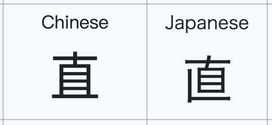
This is mitigated by the characters usually not looking that different. 直 above is the worst offender. The differences are usually pretty minor:
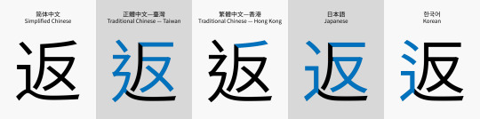
In practice, the effects are:
• Native speakers have their default font set to that language, and only rarely get annoyed by the wrong character appearing.
• Language learners sometimes accidentally learn words wrong, if they didn’t think to set up their computer language ahead of time, or if they try to simultaneously learn Chinese and Japanese.
• People’s names are often a specific variant, and spelling their name correctly is often a big deal to them, which Unicode often prevents.
• Linguistics bloggers get massively frustrated. Grr!
Unicode did later add special codes called variant selectors which are intended to alleviate this problem, but unfortunately they have basically no support. :(
[1] Not actually the beginning.
[2] So clearly “inventing computers” is kind of a vague concept and a lot of people instrumental in the long road towards modern computers, like Archimedes and Charles Babbage, were clearly not American, but you know what I mean.
[3] Also except people who design systems that need it to be possible to tell letters apart. Those people also hate it, because now people can do things like replace o (lowercase English O) with ο (lowercase Greek Omicron) to get past bad-word filters. But we already had that problem with l (lowercase L) and I (uppercase I).
97 notes
·
View notes
Text
Rizla Font Generator
Nicknames, cool fonts, symbols and tags for Rizla – R I Z L A. ︎, R I Z L A, leu. Create good names for games, profiles, brands or social networks. Submit your funny nicknames and cool gamertags and copy the best from the list.
A unique and exclusive font for your brand. The usage of an exclusive typeface in the design of a corporate or product brand is a powerful resource creating a strong and original identity.
Rizla Font Generator Kattu Mooliyo Pranayam Song Download Frozen Na Srpskom Batterybar 3.6.6 Crack Eicher 15 Anleitung Origami Design Secrets Forum Central And Eastern Europe Tomtom Utorrent Search Visual Lighting Software Crack Free Windows Server 2008 Adprep Download Best Financial Tracking Software For Mac.
How does our font generator work?
Our font generator works by taking normal text you input and converting it into a unique and fun font you can use. Here are the steps to complete this process:
Type your text into the font generator
Wait for the font generator to provide you with different styles
Choose the text style you like
Copy and paste into Instagram, Facebook, or other social media platforms
Different text styles resulting from the generator can include unique cursive, calligraphy, handwriting, and web script fonts. You can also choose to add different symbols and emojis as well.
Technically a font generator does not generate fonts. Instead, this type of text generator maps the inputted text to related, but ‘fancier’ symbols or characters that are part of the Unicode Standard.
What is Unicode?
Unicode is an internationally recognized standard for identifying the different characters we see on our computer screens.
Since computers only recognize zeros and ones (i.e. binary), each character is assigned a unique binary number. For example, the capital letter “A” has a Unicode character number of 65. A lowercase “a” has a Unicode character number of 97.
Unicode has over 137,000 characters consisting of your ‘normal’ characters, such as the text you’re reading right now, and the fancier characters you get from a font changer.
Before the establishment of the Unicode Standard, there were hundreds of different systems, known as character encodings, used to assign numbers to the characters. As you can imagine, this can make it extremely difficult for computers to share text and data with each other.
Today, Unicode has made it much easier to share text and characters amongst different operating systems, smart devices, search engines, and more.
Fonts, symbols, and emojis
So what exactly happens when you execute a font copy and paste from our text font generator? Is it actually a font, or is it a symbol?
As mentioned, the text generator fonts you see are not actually fonts. Essentially, they are symbols assigned with a Unicode value.
When you type in your text, our custom font generator then seeks out similar (but ‘fancier’) glyphs within the Unicode Standard. Technically, the ‘font’ you see is not truly a font, but rather a symbol.
That’s why you can’t perform a direct copy and paste of a Comic Sans text into, say an Instagram or a Facebook bio. Rather, fonts are a set of graphics that you can apply to Unicode glyphs. It is the website owner who dictates the specific font used on a particular site.
Emojis work the same way as symbols. They each have a unique Unicode number allowing you to perform a font generator copy and paste to whatever platform you wish.
How do I get the generated font?
Getting the generated font is easy with our online font generator. All you need to do is highlight the generated font. Then, copy and paste to whatever platform you wish.
Most computers, processors, and devices will accept and be compatible with the generated ‘font.’ However, there can be some exceptions. For example, certain websites may not be able to support certain Unicode characters.
In these instances, you’ll see a symbol of a box instead of your fancy font. This box is the default whenever a browser cannot support a certain character.
Rizla Font Generator Images
Ideas for how to use your generated font
The sky’s the limit when it comes to generating fonts. Here are just some ideas to get you started:
Stand-out and impress your followers with a unique Instagram bio
Send interesting text messages to your friends and family
Use it as a cool nickname for your web-based game
Get noticed on online platforms like Discord, Reddit, or Quora
Make your YouTube video headline or descriptions exciting and fun
Create your digital signature with a cursive-style generated font
Design wedding invitations
Use these unique fonts in your emails
You can even use a unique font for your wifi network if your router allows
And more…
Why FontSpace
FontSpace is the number one choice for generating fun, exciting, and unique fonts.
Whether it’s for your Instagram bio, getting noticed on YouTube, or creating that perfect digital signature, our generator has thousands of fonts you can choose from.
It is simple, intuitive, and easy to use, allowing you to explore endless variations! Best of all, utilize our font generator, free of charge!
On top of our font generator, we are a designer-centered website with over 64,000 free fonts to choose from. Unlike many of the other unethical font websites out there, we are completely legitimate, with all our fonts 100% licensed.
Rizla Font Generator Copy
If you have any questions or issues with downloading or installing fonts, we are always here to help. We are also happy to receive any feedback or answer any questions you may have!

post
Rizla Regular
Style
Regular
Company
Ludwig bele
Trademark
Rizla is a trademark of Ludwig bele.
Copyright
Copyright (c) 2013 by Ludwig bele. All rights reserved.
Description
Copyright (c) 2013 by Ludwig bele. All rights reserved.
RegularLudwig bele
Rizla Font Generator Software

More
Rizla Font Download
Ronnia W01 Cond
CCTreasureTroveAged W00 Regular
Style : Regular
Veteran Typewriter V2
Style : Regular
Homeland BT W01 Light
Style : Regular
Sherlock W95 StuffDots
Style : Regular
SF Fourche SC Italic
Style : Italic
WILD2 Ghixm NC Italic
Style : Italic
Albatross LT W01
Style : Regular
Achille FY W01 Italic
Style : Regular
1 note
·
View note
Text
When the convention of using ꜣ and ꜥ was established, Unicode didn't exist yet! Thinking about how to encode these on a computer came much, much later. So it's really the Unicode people's fault it's taken so long to get good support for them.
Since the Hebrew letters aleph and ayin originally represented /ʔ/ and /ʕ/, "aleph" and "ayin" caught on as names for these sounds, and a convention of writing them with half-circles caught on when transcribing things. So that's what you find in discussions of Akkadian, Proto-Semitic, Ugaritic, and so on: a right half-circle for ʔ/aleph, a left half-circle for ʕ/ayin. This was originally the convention in Egyptology too. (That's also where the symbols ʔ and ʕ come from.)
Except then it turns out there are two Egyptian phonemes that may or may not have been ʔ (it wasn't quite clear at the time), so a new convention arose: double up the half-circle for ꜣ and put a half-circle on an i for ꞽ; ꜥ got to remain as it was. That became standard practice in the field, so there's never been a strong reason to change it.
Then computers came around, and a separate convention (the Manuel de Codage standard) was established for writing Egyptian transliterations on computers, which used "A" and "a". Since this other convention existed, there was no real reason to change ꜣ and ꜥ; you'd use A/a for typing and ꜣ/ꜥ for publication, and any good Egyptian typesetting system would turn the former into the latter.
It's funny you mention Ugaritic, because the most standard transliteration of Ugaritic that I know of actually uses not just ꞽ but ꞻ and ꞿ as well (that's i, a, and u with a ʔ on top of them), which are even less supported than the Egyptological ones! These transliterations are designed to be unambiguously read first and foremost, and being easy to type is a much less important concern.
Meanwhile the Assyriologists use the term "aleph" to mean "any sound that existed in Proto-Semitic but was lost by the time period we're talking about", which leads to gems like "Old Babylonian had seven alephs". So if we're judging anyone for using the term "aleph" imprecisely, it should be those guys. Here's Huehnergard:
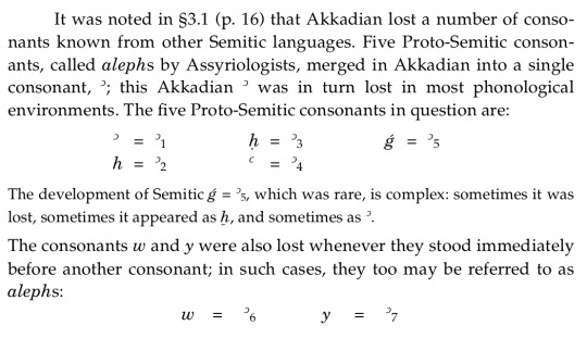
Mathematicians have spent decades trying to figure out whether there are more than aleph-zero and aleph-one; they should have just asked the Assyriologists!
@el-smacko Hopefully this helps! Tl;dr the Egyptologists had their convention first; blame the Unicode people for taking ages to assign codepoints for it and the font people for not including them in common fonts.
@thatlittleegyptologist and @somecunttookmyurl do y’all know why the Egyptian alef had to be an unrendered special character instead of a, ’, or god forbid apparently א? It’s an alef. Even if we don’t render the hieroglyphs why do we still not transliterate it in a way that can more easily be read? If we’re going to transliterate in Roman letters and if, to an extent, Semitic languages existed on a continuum with Egyptian, why not use a or, as with Phoenician and Ugaritic, use א?
113 notes
·
View notes
Text
Fiverr gigs ideas (to enjoy my 200$CAD cap until I get a wage)
Video meme editing compilation for cheap with motion graphics and subtitles (~100-200 gigs to compete with)
Aesthetic fictional worldbuilding product designs
Toony illustrations
Toony GIFs
Toony animations
Toony game assets-making
"I will" virtually build you a game map/level in GPlates/GProjector/QGIS
"I will" virtually build you a game level
Tutor and help making grand strategy game mods for cheap
Creating a quality tutorial video about the desired topic(s)
Setup, customize and teach you Linux onto your computer
Craft a full custom theme package for your desktop environment (Windows, iOS, Linux distros...)
Customize your LibreOffice workflow to support most MS-Office365 feats
Creating Blender 360 rollercoaster ride videos
Inkscape SVG animated comics tutorial
Tutor your way to Krita & GIMP & G'MIC
Making minimalist moodboard and aesthetic collages with Pinta & Paint.net
Curating aesthetically pleasing, edutaining and topical content into one customized folder for you
Gonna write you some wholesome transformation story
Making you a customized lexicon
Designing custom number systems and symbolic rules
Creating general-purpose pixel monospaced terminal fonts
Creating custom cursors, custom window title fonts, custom sound schemes, custom wallpapers, custokm window borders, custom icons, custom controls, custom desktop taskbar theme...
Making custom stickers
Customize your *nix code base
Create a custom Mosi/Bitsy game for you
Design quality flags (analog printing of them maybe?)
Translate your text (name, affirmations, descriptions) into Sumerian Cuneiforms, (Egyptian and Mayan alike) Hieroglyphs and Linear B (Syllables and Characters)
Voxel 3D art assets
Mind movies in 360 VR
Making some sweet zines with feelies and all
Creating customized/personalized fursonas/fursuits/designs
Making a stationery customized brand kit
Creating TTRPG and dollhouse maps
Writing (analog and digital) poetry
Making explorable explainations
IPA-friendly voice acting as male and female alike
Transcribing audio into IPA and vice-versa
Personalized gift game for cheap
Find you a few suitable custom full Roman names
Get you some life scripting prompt material in stationery form
Make you some worksheets, textbooks and some pedagolgical material for custom worlds
Implement virtually and analogically some computing hardware designs
Making custom bundles with swappable music (parallel multi-track custom audio player)
Teach you some about history, geography, philosophy and linguistical subtleties
Flat vector graphics
Custom keyboard mouse XL-Mousemat and monitor customizations
Create flashcard or index card "revision"/knowledge system
Making customizable paper dolls for cheap
Making customizable poseable art dolls and accessories
Compose MIDI music tunes
Analog drawings into digital SVGs
Creating a custom (3D printed keychain?) pawnsona of yourself, your pet or some custom character
Papercraft patterns for your personas
Modelize, rig, animate vintage computing machines of your own design
Shadowbox cute lamps for the night and for easy slide animations
Making you some shimejis
Produce, author and make some copies of Bluray media from supplied content (some video editing, box art, menu authoring and simple reference manual included)
Make custom levels for Portal 2, Quake (1, 2, 3 & 4), Doom and Duke Nukem
Make yourself some custom Unicode virtual keyboard for mobile web and desktop alike
Clipart illustrations for Creative Commons
Coloring, dot-to-dot, tracing letters and low-content KDP Amazon books
Draw you as a toony art pawn
Making pixel art
Making analog vector art
Crafting you a custom web-browser theme (Toyhou.se pagedolls, code blocks and just overall old DA-like customization)
Cutout traditional paper animation stop motion
Epic terminal applications with cute aesthetic ansi art-y motd and SSH access
Teaching maths (number system, writing system overview, several math operations...) in x language
Creating a original jigsaw-like pieces set out of historical maps
Animating alternate future videos
Making epic fancy fantasy QGIS maps with GPlates, GProjector, QGIS (w/ some extra Python scripting in case)
Desk calendar and more stationery printables
Risographs, posters, memopads and... prints
Tiny and large builds
Creating aesthetics and just CYOA quizzes and stories
Infographics and animated photos
Playermodel
Report cards
1-bit color pixelated graphics
Designing 2-6 colors palettes and level-designing from moodboards/stimboards/audioPlaylists for 1-bit-ish games
Greeting card-alike videos, viral videos and "Your message on..." videos
Postcard penmail letters
Full body toony pawn doll illustrations
Customized dice
Feral animals illustrations
Agentive sprite sheets, blob tilesets and innovative versatile assets in 2D and 3D alike
Stamap
Your home commune map into both analog map and digital game level
First person perspective aesthetic calm intros
Make your very own ANSI motd and BBS door system's pages
2 notes
·
View notes